Material UI の Theme のカラーパレットと Snackbar の variant の色を一致させたい

先日、Snackbar の色変更の設定をしました。しかし、これは Theme で設定しているカラーパレットとは異なる色です。
variant プロパティ
notistack では5種類のバリアントが用意されています。
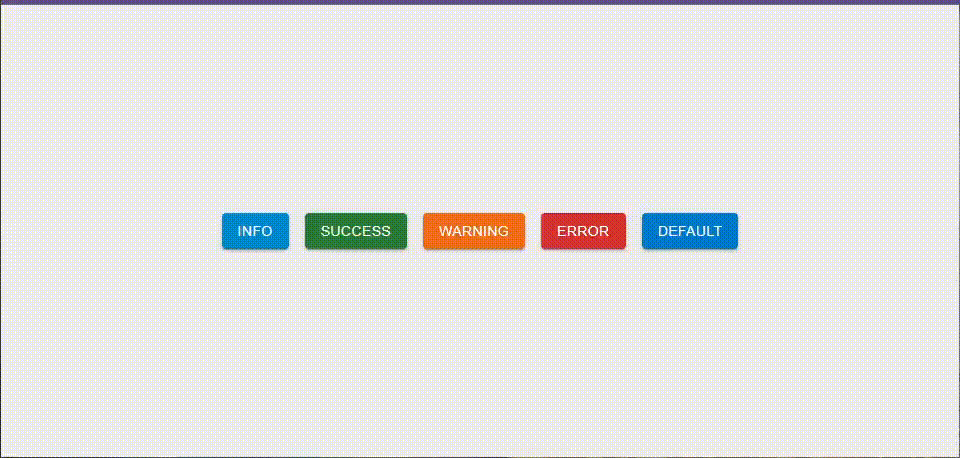
デフォルトのカラーを使用しているため、一見、カラーパレット同様の色が表示されているように見えます。
わかりやすいようにカラーパレットを設定します
const theme = createTheme({
  colorSchemes: {
    light: {
      palette: {
        error: { main: '#fcf' },
        success: { main: '#cfc' },
        warning: { main: '#ffc' },
        info: { main: '#cff' },
      },
    },
  },
})
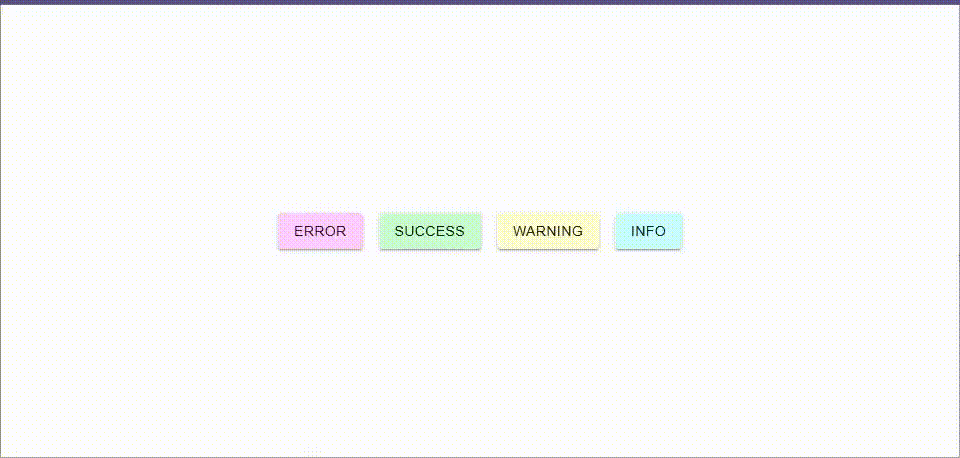
独自に設定したカラーパレットが反映していないことがわかります。
独自のカラーを Snackbar にも反映させる
styled を使って theme のカラーパレットを設定する
styled を使って、theme のカラーパレットを利用し、背景色を設定します。
const StyledMaterialDesignContent = styled(MaterialDesignContent)(({ theme }) => ({
  color: theme.palette.text.primary,
  '&.notistack-MuiContent-error': {
    backgroundColor: theme.palette.error.main,
  },
  '&.notistack-MuiContent-success': {
    backgroundColor: theme.palette.success.main,
  },
  '&.notistack-MuiContent-warning': {
    backgroundColor: theme.palette.warning.main,
  },
  '&.notistack-MuiContent-info': {
    backgroundColor: theme.palette.info.main,
  },
}))
Styled なコンポーネントを SnackbarProvider に設定する
前述で設定した styled なコンポーネントを SnackbarProvider の Components props を設定します。
  return (
    <ThemeProvider theme={theme} disableTransitionOnChange>
      <SnackbarProvider
        anchorOrigin={{ vertical: 'bottom', horizontal: 'right' }}
        maxSnack={10}
+       Components={{
+         error: StyledMaterialDesignContent,
+         success: StyledMaterialDesignContent,
+         warning: StyledMaterialDesignContent,
+         info: StyledMaterialDesignContent,
+       }}
      >
        {children}
      </SnackbarProvider>
    </ThemeProvider>
  )
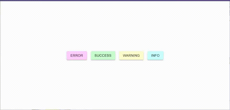
動作確認
まとめ
styled で theme の情報を取得することで同一カラーを設定できることがわかりました